Hotel Interior Color Trends Popular in 2026
Thứ 3, 04/08/2026
Administrator
125
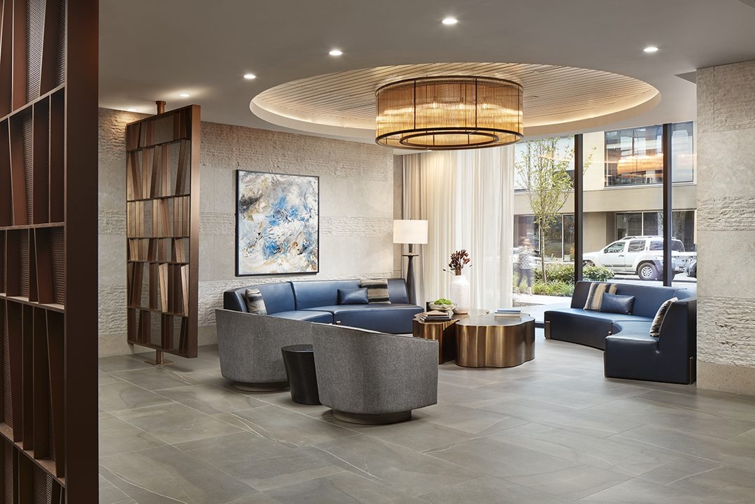
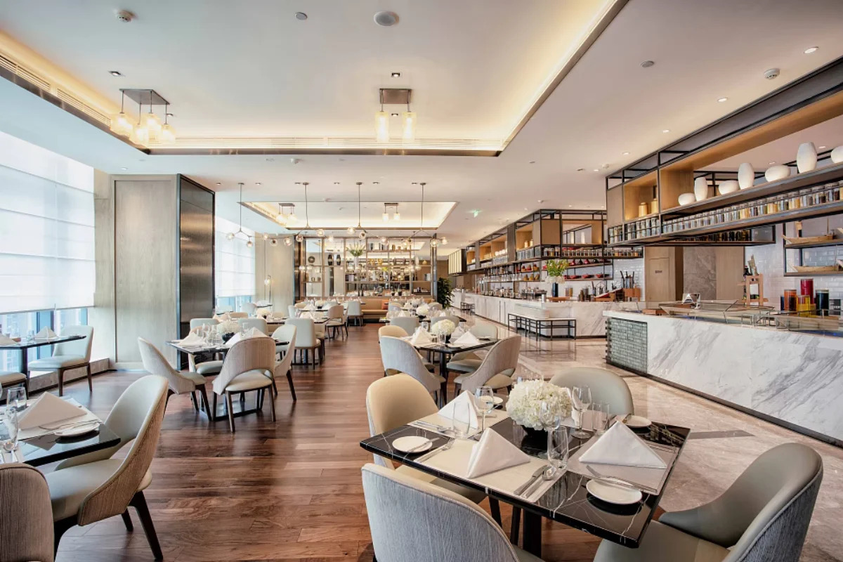
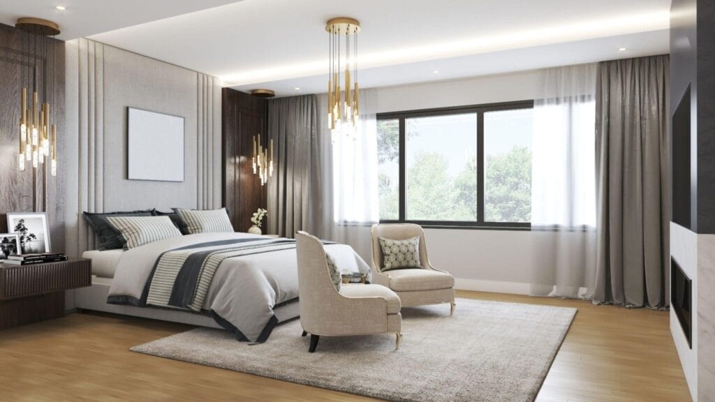
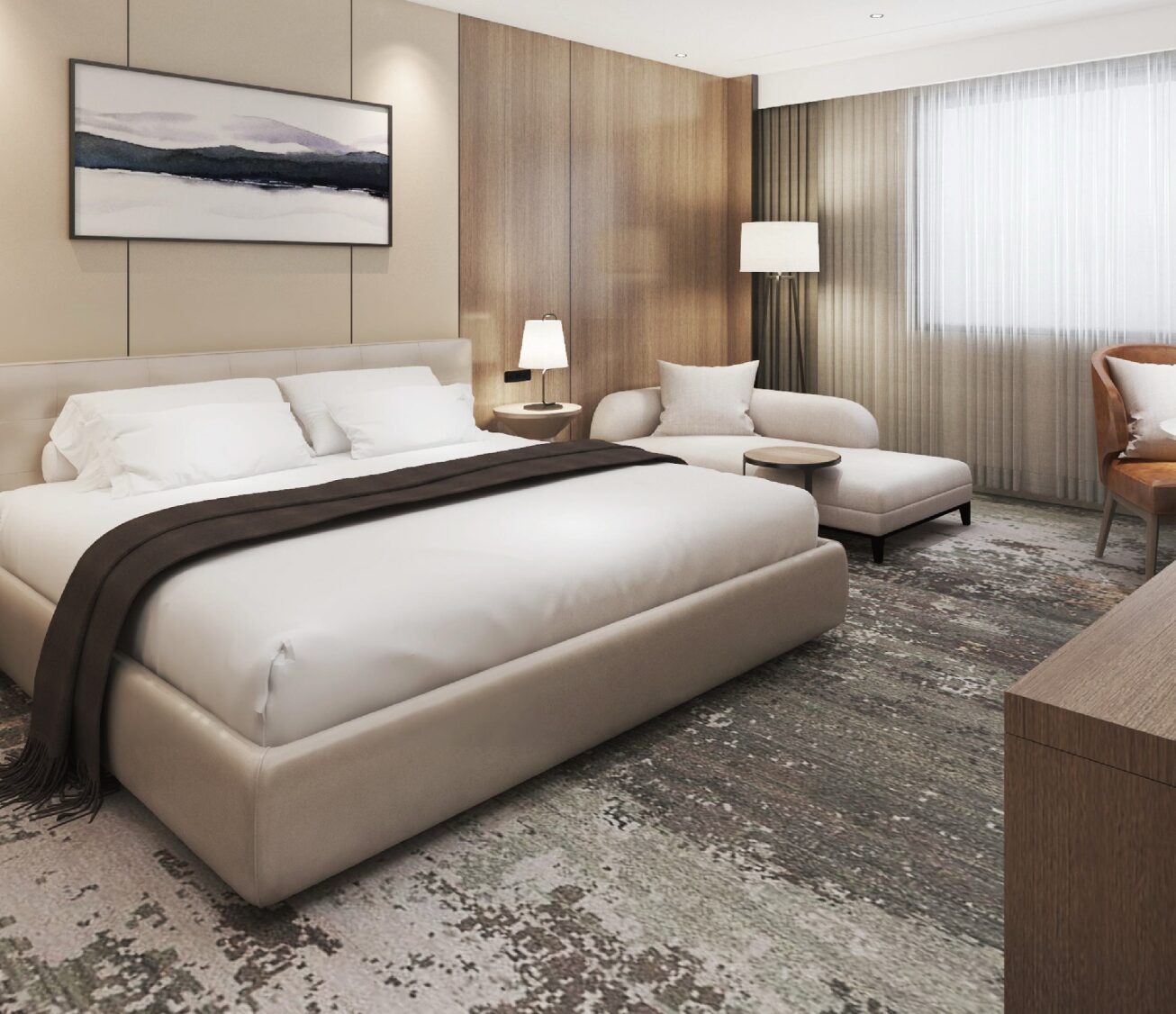
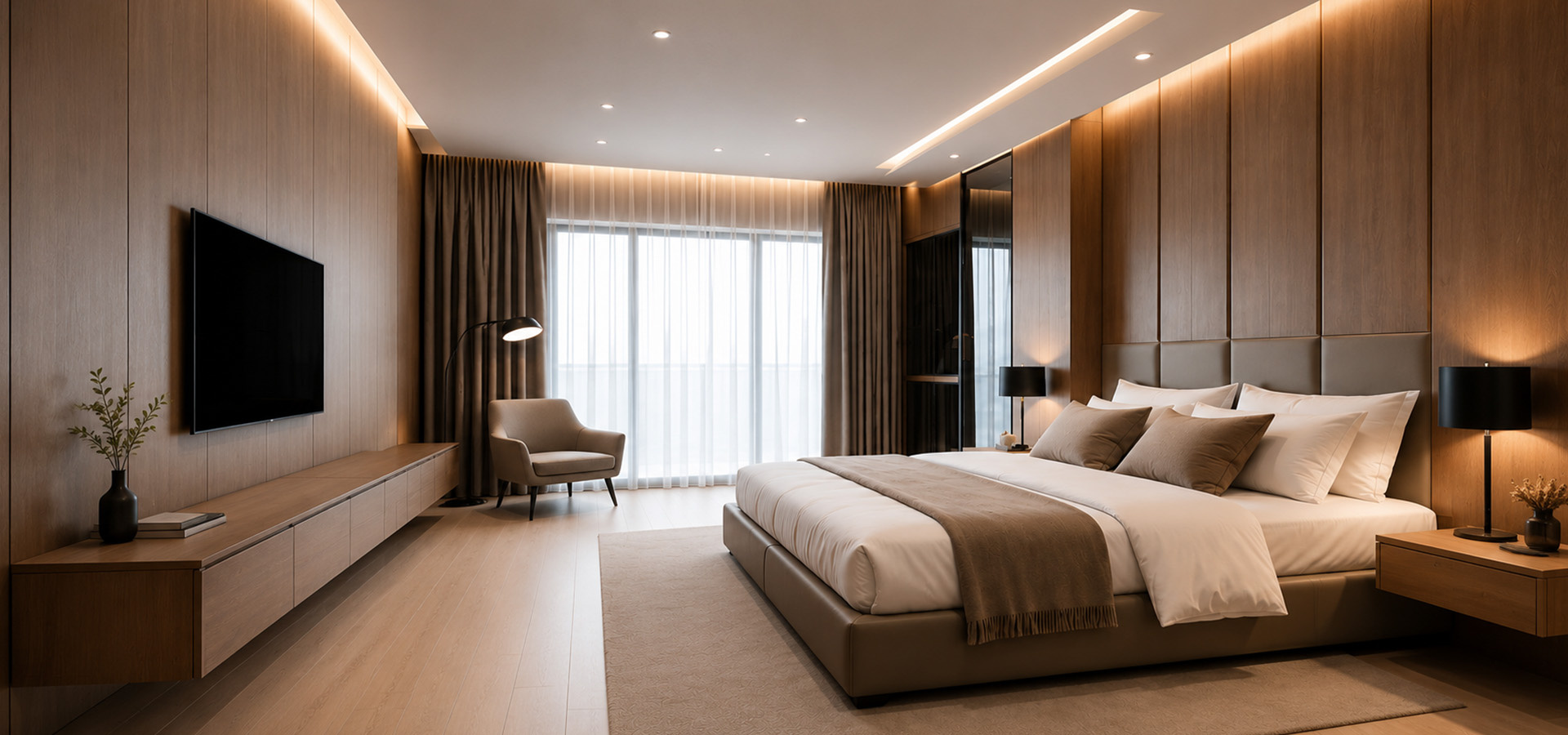
Hotel interior color trends in 2026 focus on creating spaces that are elegant, welcoming, and emotionally engaging through timeless palettes and nature-inspired tones. In this article, Ngoc Hoang Anh explores the latest color trends that help hotels elevate guest experience, strengthen brand identity, and achieve lasting visual appeal.
1. Nature-Inspired Color Palettes Continue to Dominate
Nature-inspired color palettes remain one of the strongest hotel interior trends in 2026, reflecting the growing demand for wellness, sustainability, and timeless design. By incorporating colors found in natural landscapes, hotels can create calming environments that promote relaxation while maintaining a sophisticated and enduring aesthetic suitable for modern hospitality.
1.1 Earthy neutrals for timeless elegance
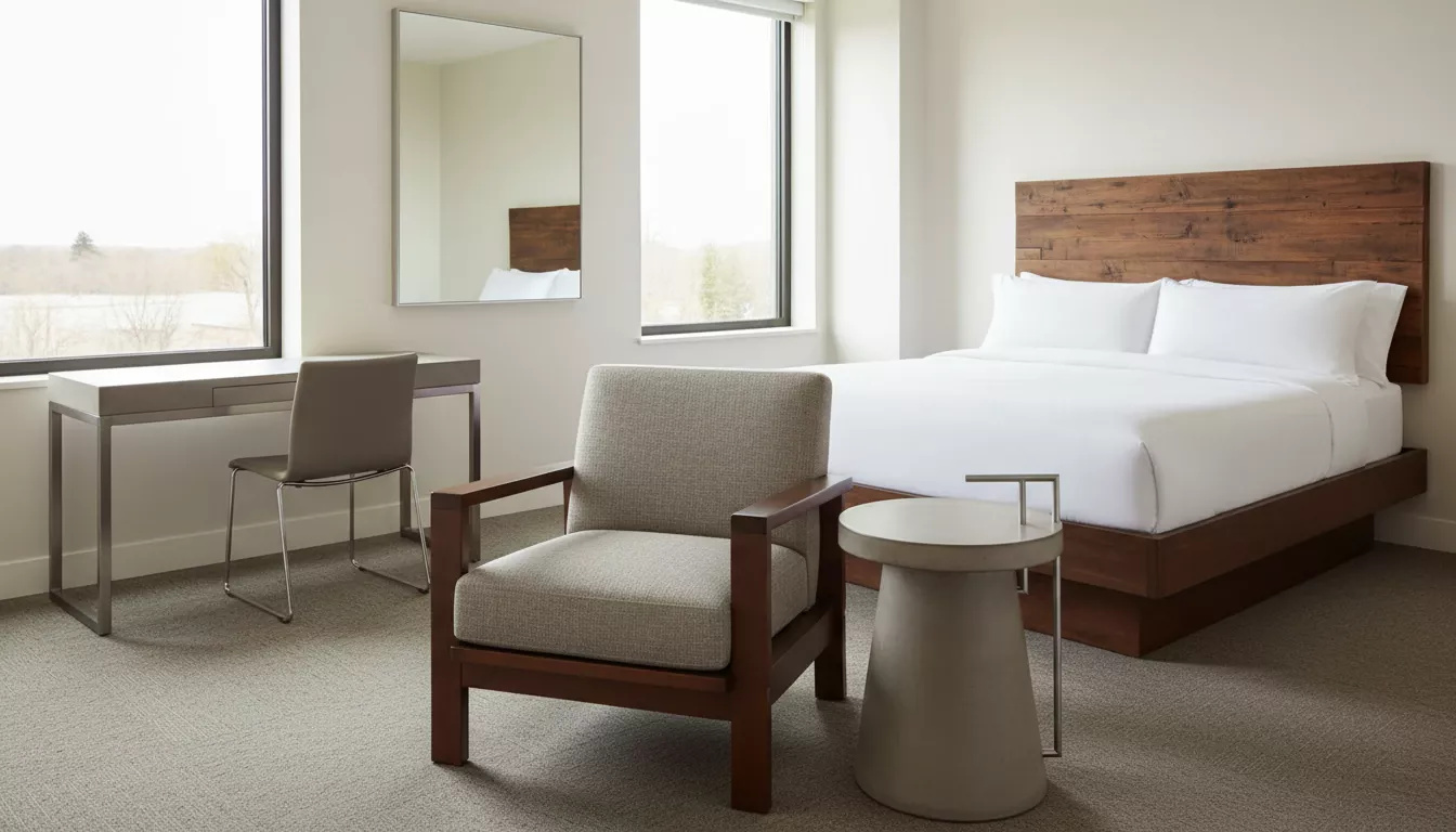
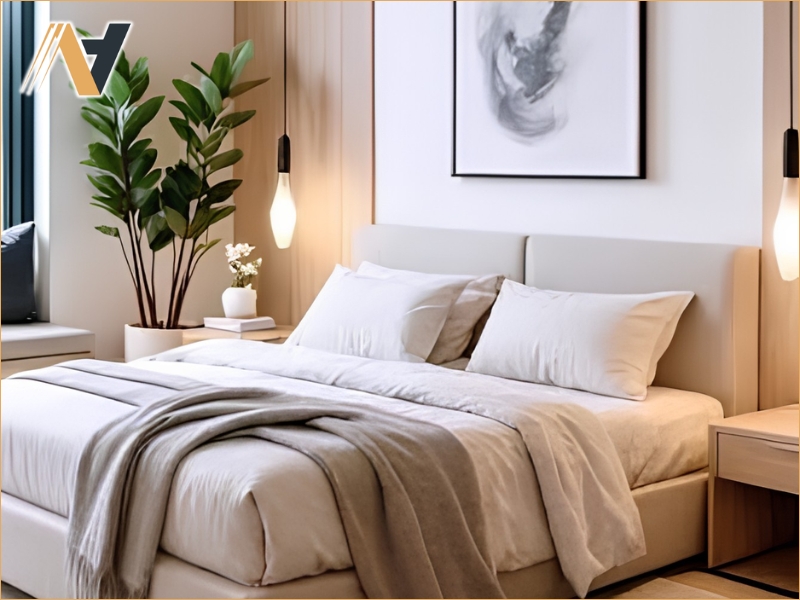
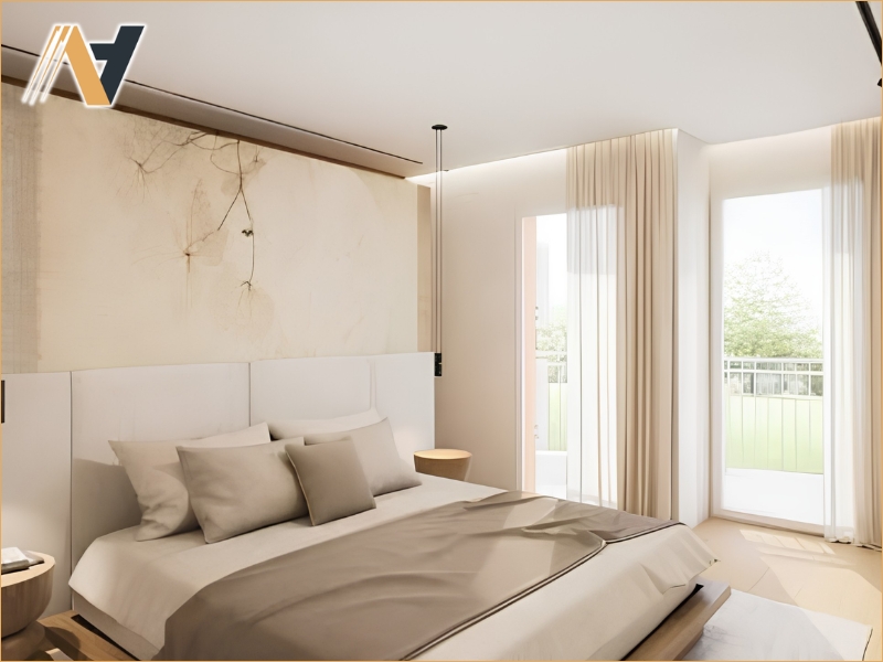
Earthy neutral tones such as beige, sand, taupe, and warm gray provide a versatile foundation for hotel interiors. These colors create a sense of warmth, balance, and sophistication while complementing a wide range of furniture materials, making them ideal for guest rooms, lobbies, and public spaces.
1.2 Botanical greens for wellness-focused interiors
Muted shades of green inspired by forests and plants continue to gain popularity as hotels emphasize wellness-oriented design. These colors evoke freshness and tranquility, helping guests feel connected to nature while reinforcing sustainable hospitality concepts through a calming and restorative atmosphere.
1.3 Ocean-inspired blues for tranquil environments
Soft blues inspired by the sea and sky bring a peaceful and refreshing ambiance to hotel interiors. Particularly suitable for resorts and coastal properties, these tones create a relaxing atmosphere that enhances guest comfort while adding a refined sense of openness and understated luxury.
2. Warm Luxury Colors for Premium Hospitality
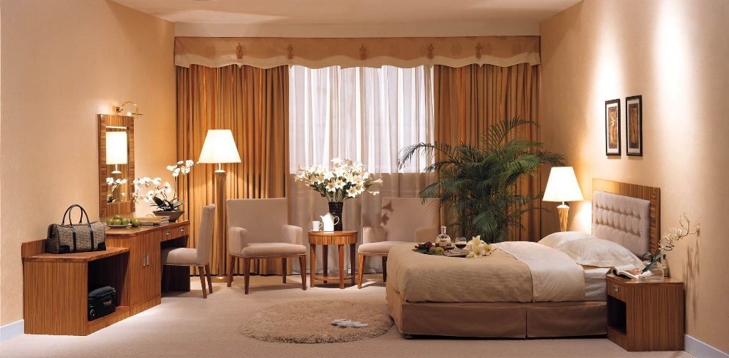
Warm color palettes are becoming increasingly popular in hotel interior design as they create a welcoming atmosphere while expressing elegance and exclusivity. In 2026, designers are combining rich earthy tones with subtle metallic accents to achieve a luxurious yet comfortable environment that enhances the overall guest experience.
2.1 Rich terracotta and clay tones
Terracotta and clay-inspired colors bring warmth, authenticity, and natural sophistication to hotel interiors. These earthy shades pair beautifully with wood, stone, and textured fabrics, creating inviting spaces that feel both contemporary and timeless while adding depth to guest rooms and public areas.
2.2 Soft caramel and warm wood hues
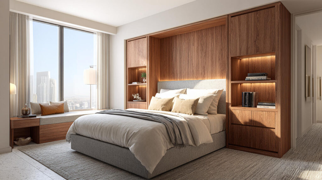
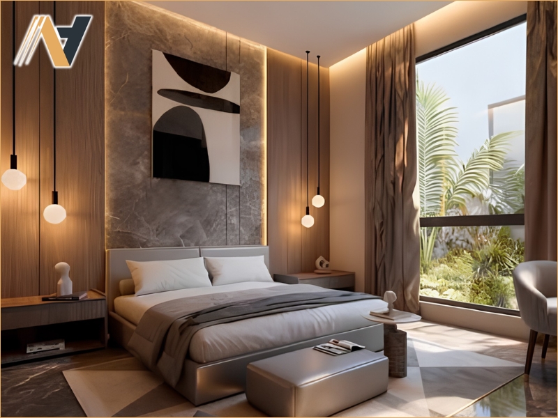
Soft caramel tones and warm wood-inspired colors contribute to a cozy and relaxing atmosphere. Frequently used in furniture, wall finishes, and decorative elements, these hues enhance visual comfort and create harmonious interiors that appeal to a wide range of hospitality concepts, from boutique hotels to luxury resorts.
2.3 Champagne and bronze accents
Champagne and bronze metallic finishes are widely used as accent colors to elevate the perception of luxury without overpowering the overall design. Applied through lighting fixtures, furniture details, and decorative accessories, these elegant tones introduce subtle sophistication while complementing warm neutral color palettes.
3. Minimalist Monochromatic Color Schemes
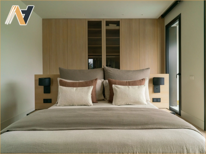
Minimalist monochromatic color schemes continue to gain popularity in hotel interior design due to their timeless elegance and visual simplicity. By using different shades of the same color family and emphasizing texture over contrast, hotels can create refined spaces that feel calm, spacious, and effortlessly luxurious.
3.1 Layered neutral tones for visual harmony
Combining multiple shades of beige, gray, ivory, or greige creates depth without overwhelming the interior. This layered approach adds sophistication and balance while allowing furniture, lighting, and architectural details to become more visually prominent within the overall design.
3.2 Black accents for contrast and definition
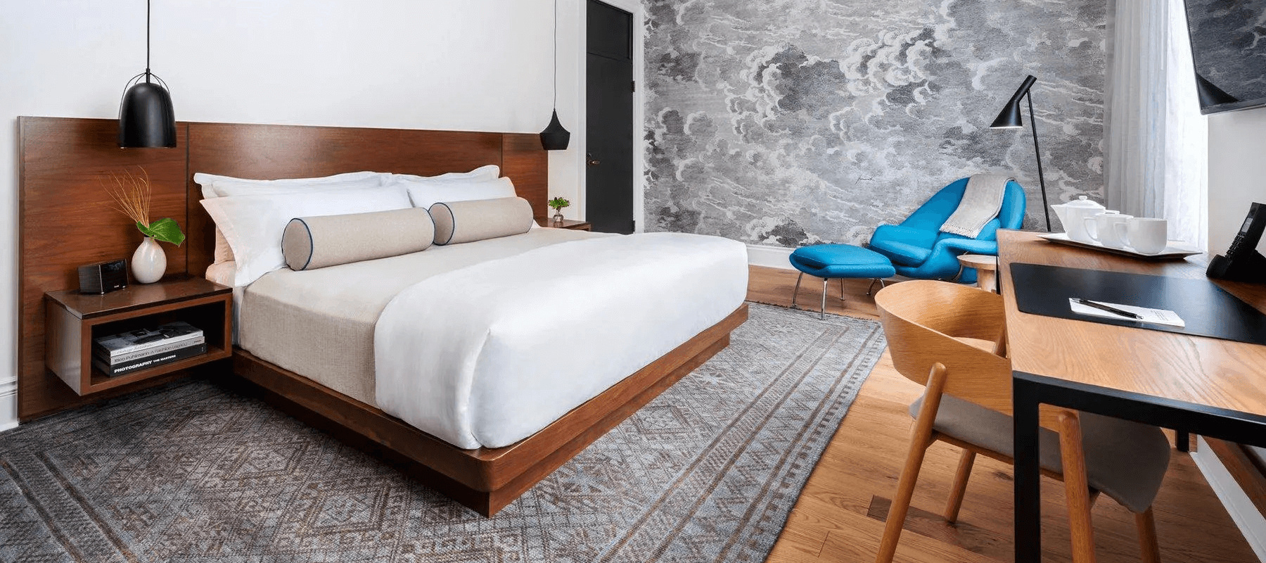
Strategically placed black elements such as metal frames, lighting fixtures, furniture details, or decorative trims provide strong visual contrast against neutral backgrounds. These accents enhance architectural definition and introduce a modern, elegant character without disrupting the calm atmosphere of the space.
3.3 Textural variation instead of bold colors
Rather than relying on vibrant color combinations, minimalist interiors achieve visual richness through the use of different textures and materials. Natural wood, stone, fabric, leather, and matte finishes create subtle contrasts that add warmth and depth while preserving a clean and sophisticated aesthetic suitable for contemporary hotels.
4. Statement Accent Colors in Modern Hotels
While neutral palettes remain the foundation of many hotel interiors, carefully selected accent colors are becoming increasingly important for adding personality and creating memorable visual experiences. In 2026, designers use bold yet controlled accent colors to highlight architectural features, reinforce brand identity, and introduce a sense of sophistication without overwhelming the overall space.
4.1 Deep navy and forest green highlights
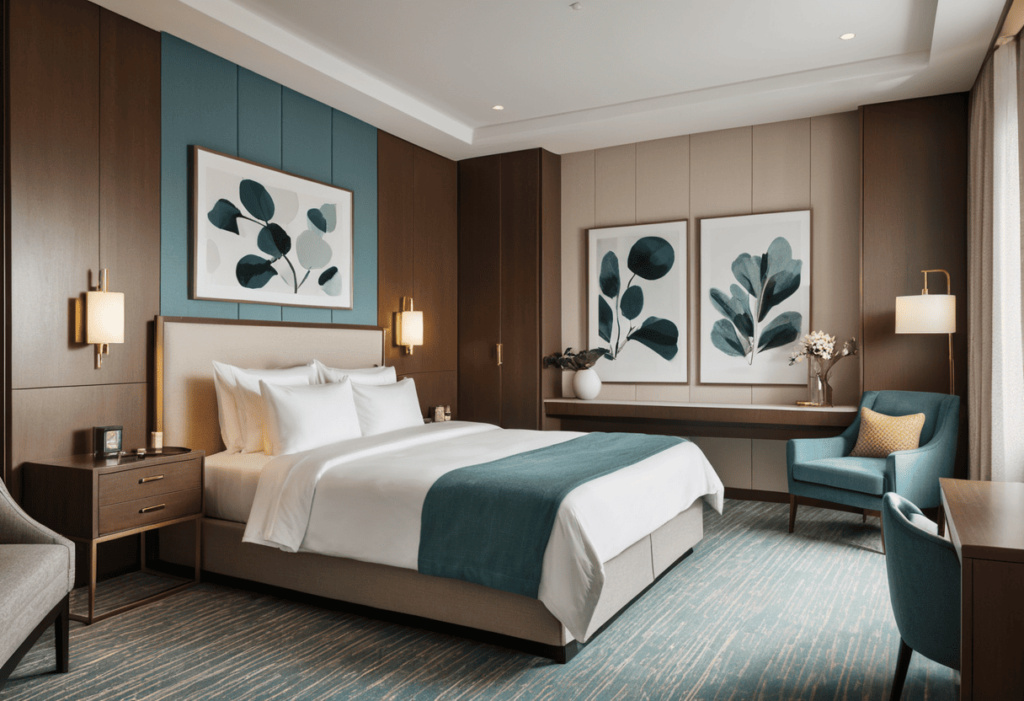
Deep navy and forest green are among the most popular accent colors for luxury hotels, offering a refined and elegant appearance. Applied to feature walls, upholstered furniture, or decorative panels, these rich tones create depth and contrast while complementing natural materials and neutral color schemes.
4.2 Burgundy and muted red accents
Burgundy and muted red shades introduce warmth, richness, and exclusivity to hotel interiors. Used selectively in seating, artwork, rugs, or decorative accessories, these colors create eye-catching focal points that enhance the luxurious atmosphere while maintaining visual balance throughout the space.
4.3 Artistic color applications through décor
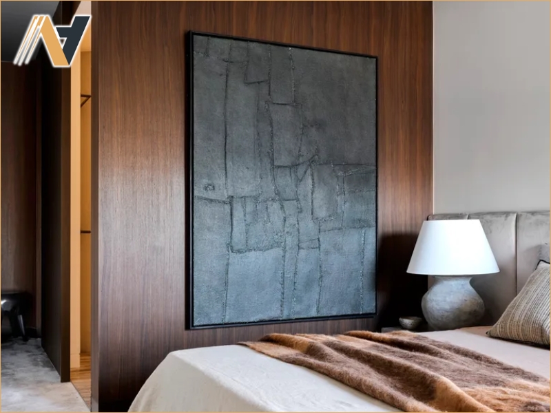
Decorative elements such as paintings, sculptures, cushions, and statement lighting provide opportunities to introduce accent colors creatively. This approach allows hotels to refresh their interiors more easily over time while adding distinctive character and supporting a unique brand identity without requiring major renovations.
5. Choosing Color Palettes Based on Hotel Positioning
Selecting the right color palette should go beyond following design trends, as it must also reflect the hotel's brand identity, target audience, and overall positioning. A well-planned color strategy helps create a consistent guest experience while reinforcing the unique character of each hospitality concept.
5.1 Luxury hotels and refined neutral palettes
Luxury hotels often rely on sophisticated neutral tones such as ivory, greige, taupe, and warm gray to create an elegant and timeless atmosphere. These colors provide a refined backdrop for premium materials, bespoke furniture, and high-end decorative elements, reinforcing exclusivity and understated luxury.
5.2 Boutique hotels with distinctive personalities
Boutique hotels have greater flexibility to experiment with unique color combinations that express creativity and individuality. Carefully selected bold accents, artistic palettes, and locally inspired colors help establish a memorable identity, allowing guests to associate the interior design with a distinctive hospitality experience.
5.3 Resort hotels inspired by surrounding landscapes
Resort hotels typically draw inspiration from their natural surroundings, incorporating colors that reflect beaches, forests, mountains, or tropical environments. By integrating landscape-inspired palettes, these properties create a stronger connection between indoor and outdoor spaces while enhancing the sense of relaxation and destination authenticity.
Conclusion
Hotel interior color trends in 2026 emphasize timeless elegance, natural inspiration, and personalized luxury. By selecting color palettes that align with a hotel's positioning and guest expectations, hospitality businesses can create inviting environments that enhance comfort, strengthen brand identity, and leave a lasting impression on visitors.
For hotels seeking customized interior solutions, Ngoc Hoang Anh provides Vietnam hotel furniture OEM services with bespoke furniture designs that complement the latest color trends while ensuring durability, functionality, and premium hospitality aesthetics.
-----
NGOC HOANG ANH TRADING COMPANY LIMITED
Tax Code: 3702874413
Address: No. 288/28/10 Huynh Van Luy Street, Zone 7, Phu Loi Ward, Ho Chi Minh City, Vietnam
Warehouse: No. 1/91, Thuan Giao 02 Street, Binh Thuan 2 Residential Quarter, Thuan Giao Ward, Ho Chi Minh City, Vietnam
Phone/Whatsapp/Wechat: +84342076666
Email: info@ngochoanganh.com.vn