Hotel Bedroom Interior Color Coordination by Style
Thứ 6, 15/08/2025
Administrator
134
Color does more than create a first impression; it also influences the emotions of guests during their stay. Coordinating hotel bedroom colors effectively can increase aesthetic value and create a memorable experience. Join Ngoc Hoang Anh to explore the latest color coordination techniques and trends.
1. The 60-30-10 Rule in Interior Color Design
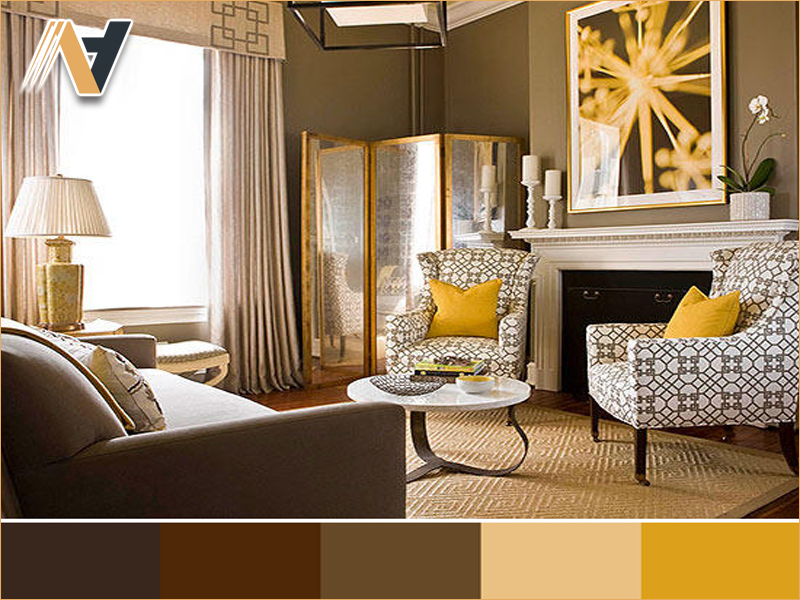
The 60-30-10 rule balances visual appeal by dividing 60% of the space into a base color, 30% into a secondary color, and 10% into an accent color. This approach delivers a harmonious composition, ensuring hotel bedrooms are visually pleasing yet have a focal point.
Examples:
-
Modern style: 60% white (base), 30% gray (secondary), 10% gold (accent)
-
Classic style: 60% cream (base), 30% wood brown (secondary), 10% gold (accent)
2. Color Psychology in Hotel Design
Colors influence both aesthetics and guest behavior. Choosing the right tones creates an atmosphere that aligns with the experience a hotel aims to provide, whether luxurious, cozy, relaxing, or refreshing.
2.1 Warm Colors
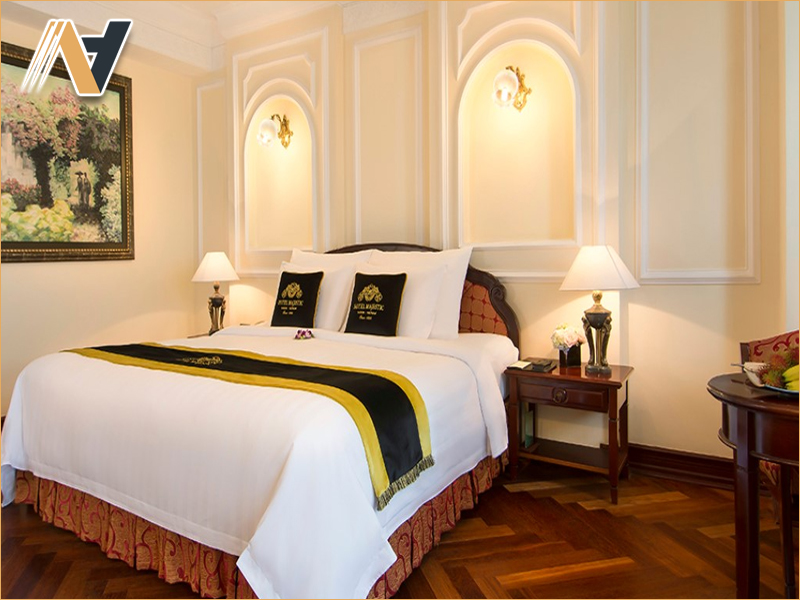
Shades like burgundy, gold, and wood brown evoke luxury, warmth, and intimacy. They are ideal for upscale hotels or boutique properties seeking a refined yet welcoming ambiance.
Example: Cream walls, wood furniture, and gold accents create a cozy winter atmosphere with a touch of elegance.
2.2 Cool Colors
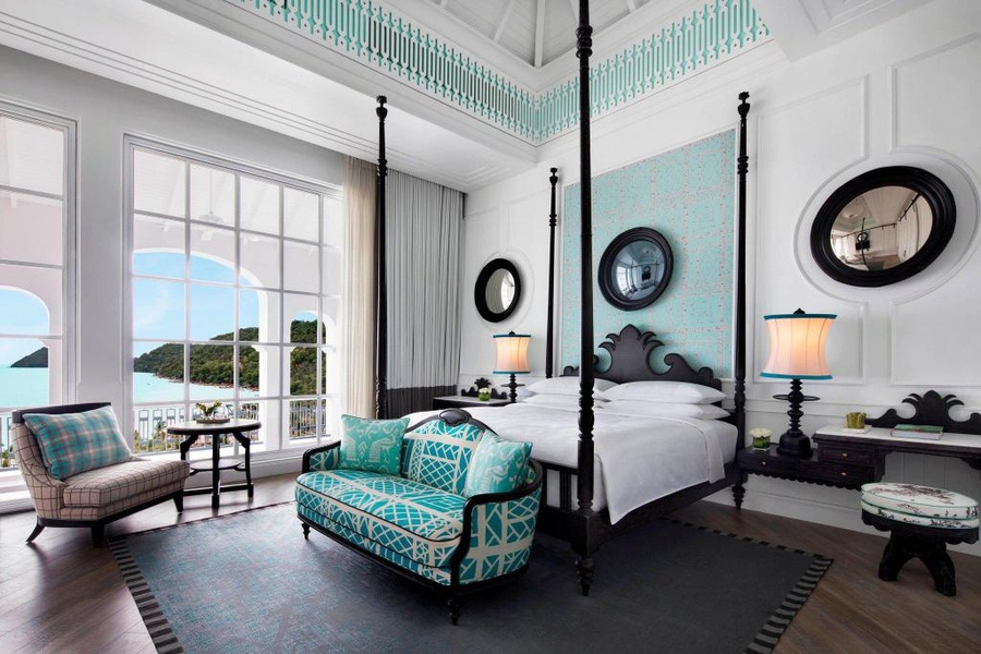
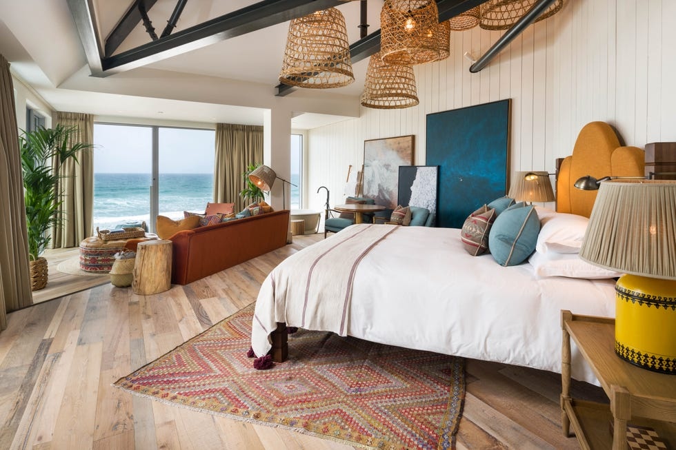
Soft blues, greens, and blue-grays evoke calm and freshness, perfect for beach resorts or hotels in hot climates.
Example: White walls, turquoise bedding, and coastal artwork for a refreshing, nature-inspired feel.
2.3 Neutral Colors
White, beige, and gray are versatile foundations that pair well with various styles. They allow decorative accents or bold colors to stand out.
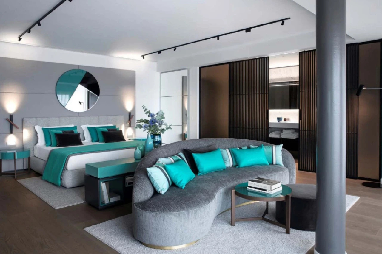
Example: A white and gray base with gold or navy accents for a sophisticated yet understated look.
By skillfully combining these three groups, hotels can create bedrooms that are both visually appealing and emotionally engaging for their target guests.
3. Coordinating Colors for Desired Guest Experiences
Color is a tool for shaping the mood and atmosphere of a hotel bedroom. Depending on brand positioning and target guests, investors can choose palettes that leave a strong impression and enhance the stay.
3.1 Relaxing Spaces
Pastels, light blues, and soft beige tones reduce stress and promote tranquility, perfect for boutique hotels or resorts in quiet locations.
Example: Beige walls, pastel bedding, and sheer white curtains create a serene and inviting atmosphere.
3.2 Luxurious Spaces
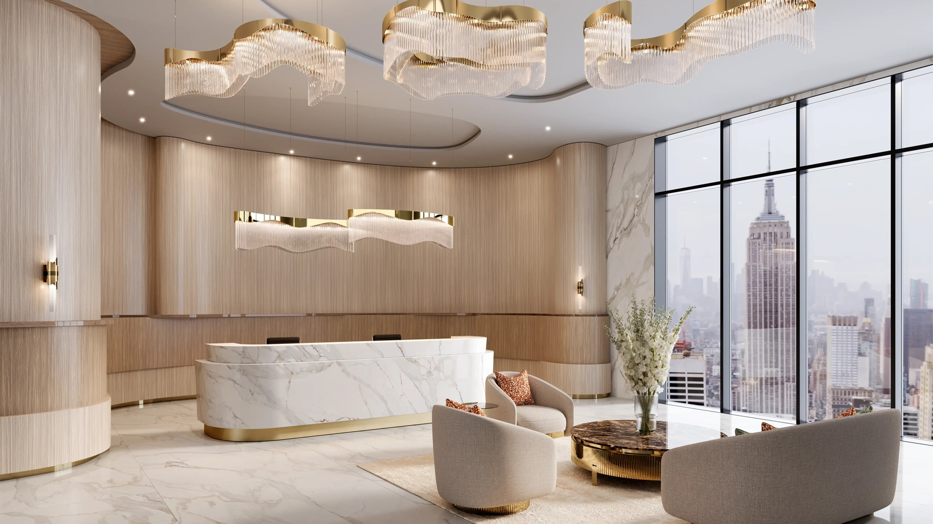
Rich tones paired with metallic accents express elegance and sophistication, ideal for 4–5-star or high-end hotels.
Example: Walnut furniture, cream walls, and gold chandeliers for a grand, refined look.
3.3 Youthful Spaces
Bright contrasts like yellow and blue or orange and charcoal gray create energy and vibrancy, suited to hotels targeting young travelers or adventure tourists.
Example: White walls, pop-art prints, and lemon-yellow bedding for a fresh, upbeat vibe.
4. Color Coordination by Style
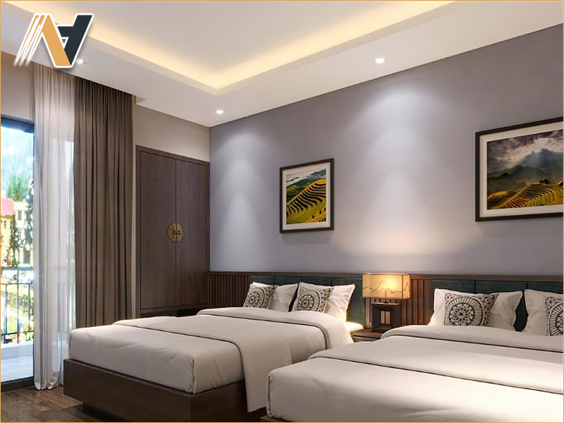
Each hotel bedroom style has a distinct palette that reflects brand personality and shapes the guest experience. Choosing the right palette enhances visual appeal and ensures consistency with the overall design.
4.1 Classic Style
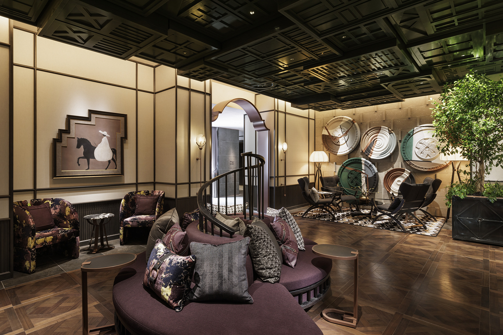
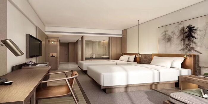
Gold, burgundy, and wood brown create an opulent, warm, and grand feel. Gold is used for decorative accents, while burgundy and brown form the main base.
4.2 Modern Style
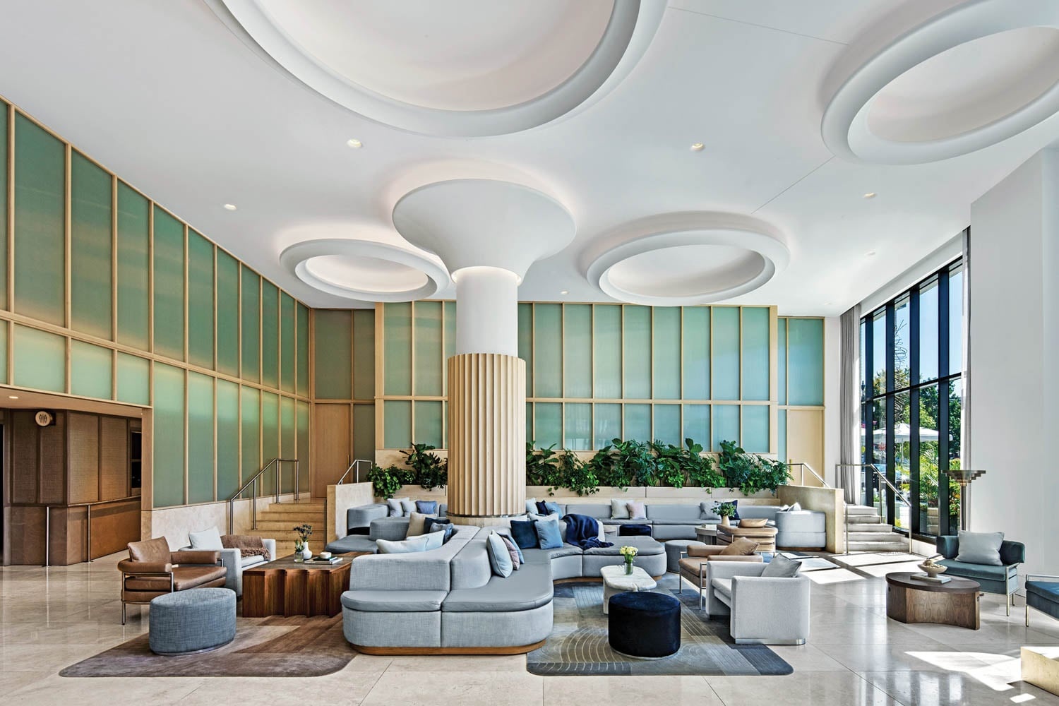
White, gray, and navy express freshness, structure, and professionalism. White serves as the base, gray as the secondary tone, and navy as the accent, creating depth and airiness.
4.3 Minimalist Style
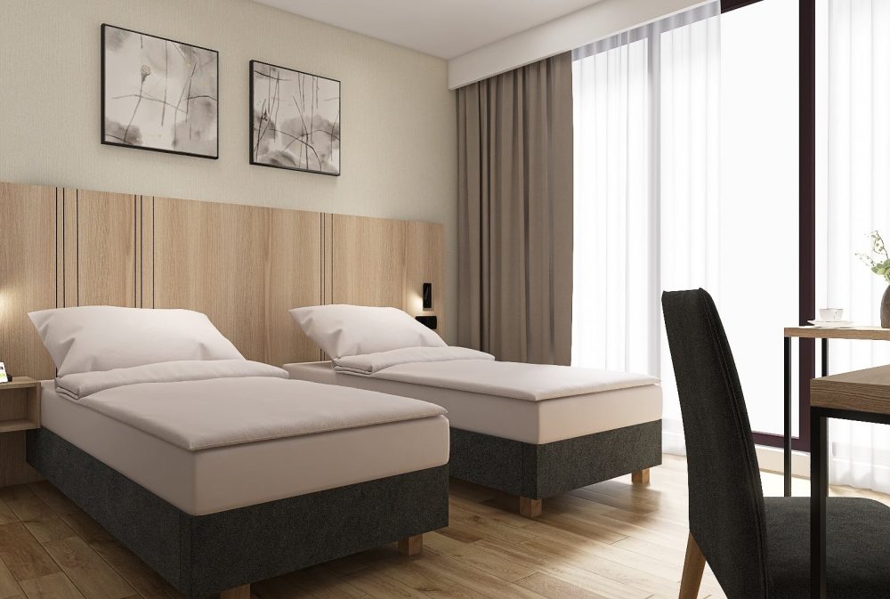
White, beige, and light gray convey calm, refinement, and simplicity, ideal for reducing visual clutter while maintaining elegance.
4.4 Tropical Style
White, green, and sandy yellow bring vibrancy and a connection to nature. Green reinforces the botanical feel, while sandy yellow adds warmth and comfort.
5. 2025 Hotel Bedroom Color Trends
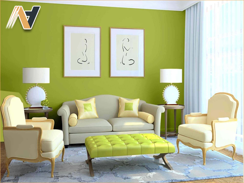
The 2025 palette focuses on balancing nature-inspired tones with modern sophistication. Earth tones, deep ocean blue, luxurious beige, and olive green are trending globally for their ability to relax guests and fit various styles.
5.1 Earth Tones
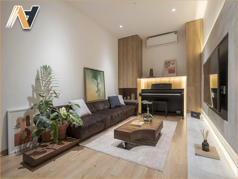
Shades of brown, beige, and terracotta create warmth and connection to nature, especially when paired with natural wood finishes.
5.2 Deep Ocean Blue
A rich blue that brings depth and calm, often used as an accent in bedding, cushions, or feature walls.
5.3 Luxurious Beige
A timeless base that pairs well with bolder accents while maintaining elegance, suitable for both modern and classic interiors.
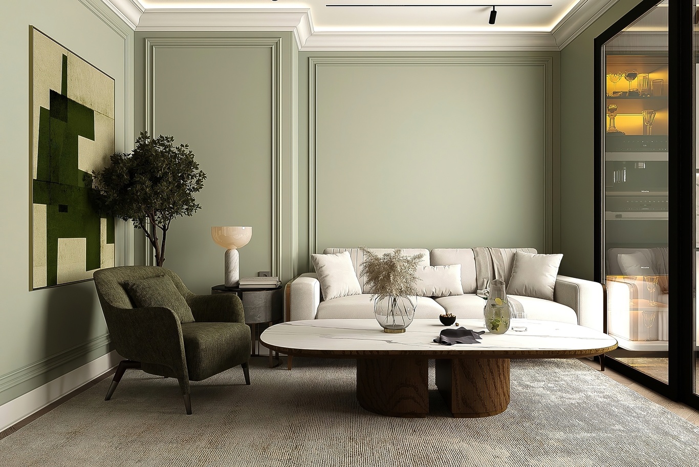
5.4 Olive Green
Evokes peace and a natural connection, especially when combined with warm lighting and linen fabrics.
6. Conclusion
Coordinating hotel bedroom colors is not just about aesthetics; it is key to delivering a complete guest experience. A well-balanced palette aligns with the interior style, reinforces brand identity, and evokes the desired emotions for each target segment. From core design principles to 2025 color trends, every choice shapes the atmosphere and perception of the space. With proven expertise in Vietnam hotel furniture OEM, Ngoc Hoang Anh is ready to partner with investors to turn creative visions into reality through high-quality, custom-made hotel interiors. Contact us today for personalized consultation and tailored solutions for your project.
-----
NGOC HOANG ANH TRADING COMPANY LIMITED
Tax Code: 3702874413
Address: No. 288/28/10 Huynh Van Luy Street, Zone 7, Phu Loi Ward, Ho Chi Minh City, Vietnam
Warehouse: No. 1/91, Thuan Giao 02 Street, Binh Thuan 2 Residential Quarter, Thuan Giao Ward, Ho Chi Minh City, Vietnam
Phone/Whatsapp/Wechat: +84342076666
Email: info@ngochoanganh.com.vn

